Client
Sanga
Services
Head of Design (UX/UI)
Year
2021-2022
‘Sanga’ startup was founded in 2019, and has developed an App based on AI technology that allows users to receive a custom daily mindfulness training created by different micro-activities, digested and personalized to their profile, mood, time and place
After the new version was released to the market, I led a process of usability testing in order to extract insights, translate them into action items and prioritize them to improve the user experience.
*It is recommended to go through the first case study of Sagna before continuing reading.
The Process
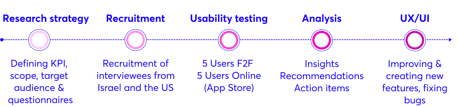
Defining KPI’s
It was important for us to talk to users of different genders, ages and to pay attention to the different experiences of senior versus new users.
We Focused on 3 main topics:
1. Navigation
- Intuitive Navigation (from the Onboarding stage)
- Understanding the concept of ‘My Moment’ > Library > Profile
2. Overall experience
- Feelings and emotions – what the new experience brings up?
- What is the experience of switching to the new version?
3. What & how to improve
- What do users like / dislike about it and why?
- What features would bring users to use the app?
Research Tools
Qualitative research – the results were cross-referenced with data from Mixpanel events.
- Interview Duration: 20-40 min
- Target Audience Age: 30-45
- Digital Literacy: Medium > High
- Starting Point : Downloading the app
F2F | 7 users from Israel
- Interview
- shadowing
- Screen recording
ZOOM | 5 users from the US
- Interview
- Screen shooting
MIXPANEL | 904 Active Users
- Analyzing new events compare to old ones
Significant insights
+ Recommendations and Action items
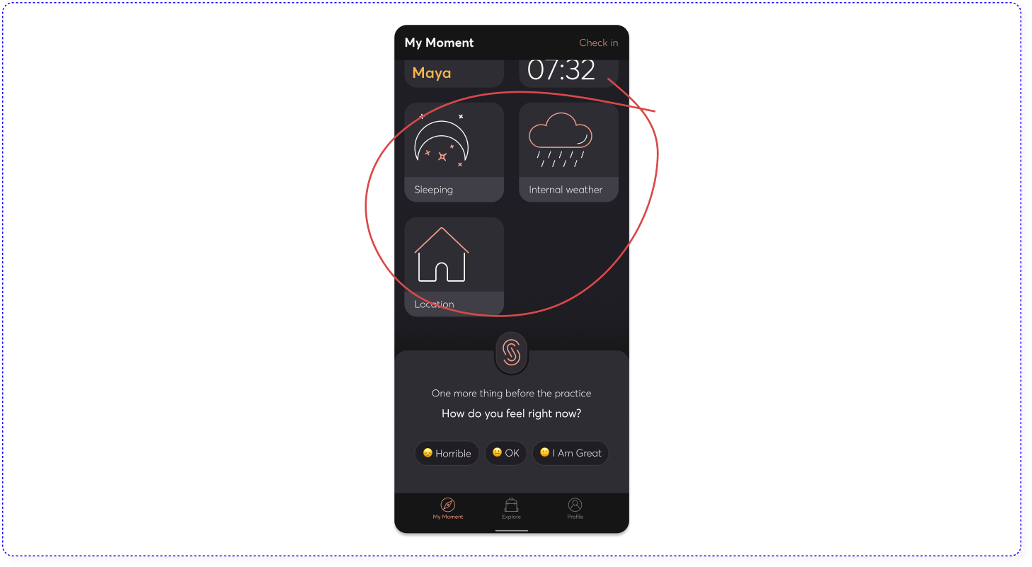
1. ‘My Moment’ Navigation
On the main screen, users clicked on the upper right corner which wasn’t clickable, instead of clicking on the CTA in the keyboard to start their moment, they went to other tabs, and only then returned to ‘My Moment’ and went through the process as expected.
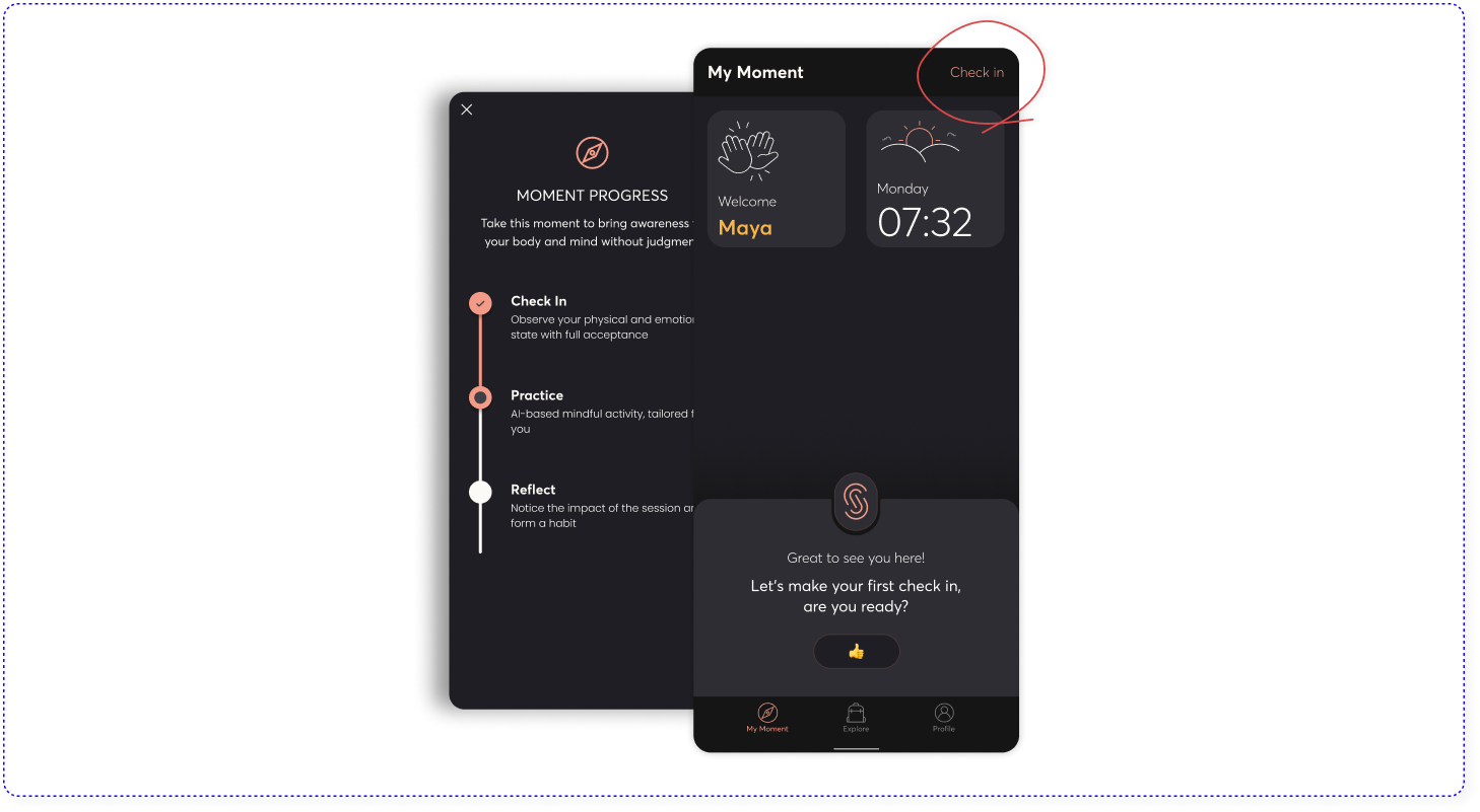
 Action Items
 Action Items
- Redesign the CTA buttons in the keyboard with more contrast
- Update the onboarding stage with will clear explanation of “My Moment”.
- The current stage has become clickable in order to get info about “My Moment” experience.
![]()
2. Self reflection can be overwhelming
The reflection of emotions during the check-in phase can overwhelm negative emotions and hence judgment, self-criticism and even prohibitions from using the app.
“I got a harsh reflection of my emotional state. I saw all the widgets on one screen and realized how much the fight I had with my partner was affecting me. It was really Hoverwolming”. S. 45.
Action Item
Validation – We need to convey the message that these are legitimate emotions in the human experience in order to give the user a safe zone to practice in.
![]()
3. Free choice
Although Sanga has developed a smart AI learning model that adapts the practice to the user to his physical and mental state, the user must be given a free choice to replace the suggestion he received during the Practice phase.
“Sometimes I go into the app to meditate, so after the check-in part I want to have the option to choose what I already know I want”. L. 32
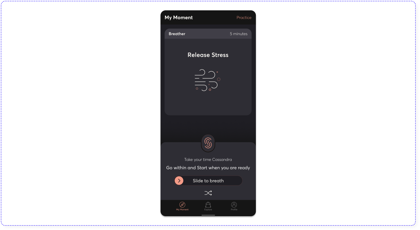
Action Item
Upon receiving the Practice, there should be an option to replace it to another one.
![]()
4. Activation of different senses
When users received breathing exercises, they need to look at the screen in order to follow the breathing rhythm, they lacked an additional indication that does not rely on the sense of sight, so that they could close their eyes during the exercise and deepen their presence in the moment, an essential principle in the world of mindfulness.
“I was expecting to hear sound of something natural like waves, a river, a bonfire, wind. sound that will guide me to breathe when my eyes are closed”. R. 30.
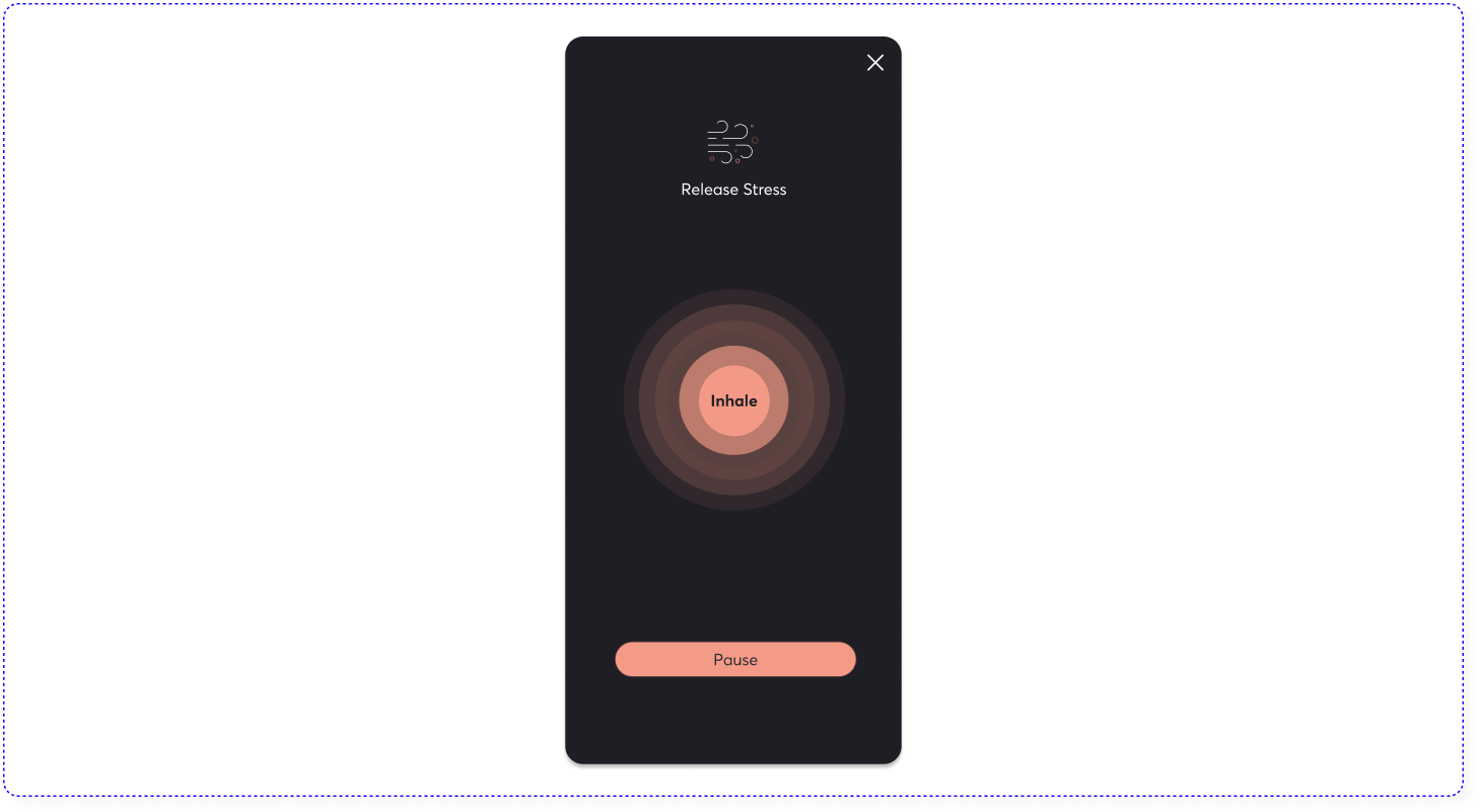
Action Item
Adding Sound and/or vibration
![]()
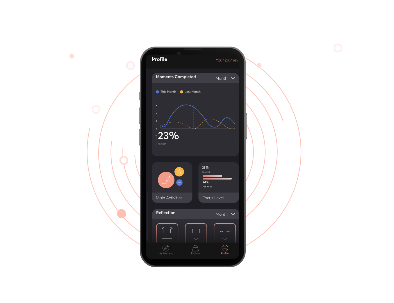
5. Users want to see their progress
It is important for the user to see the path he takes over time in his mindfulness journy – how he is before and after an practice, which practice affect him and how, what are his main causes of stress in life and more. If we can reflect this correctly, the level of engagement and practices will increase.
“I would like to see a widget with single-valued information like for example, show me how much my heart rate dropped after the practice, or how much more focused I am”. A. 31
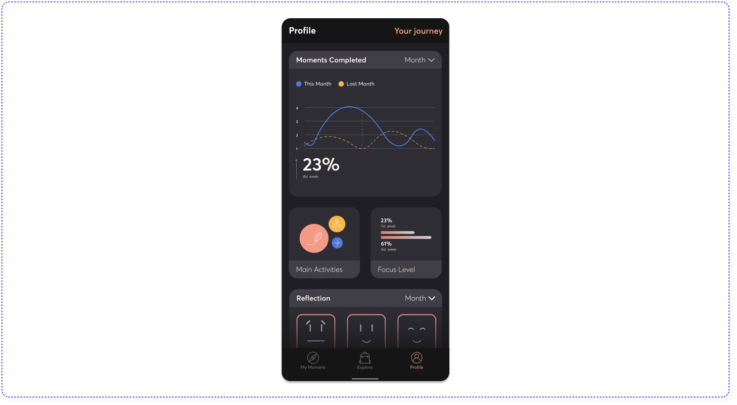
Action Item
Adding a Personal Profile in a new tab, which will include interesting and meaningful data to the user through interactive widgets that includes statistics that reflect progress.
![]()
6. ‘My toolbox’
Creating an orderly place, where the user will see the mindfulness tools he acquired along the way and allow him to repeat practices whenever he wants, will cause him a high level of engagement.
“I would like to see the practices I did so that I can repeat them and also to see the journey that I go through over time”. S. 45.
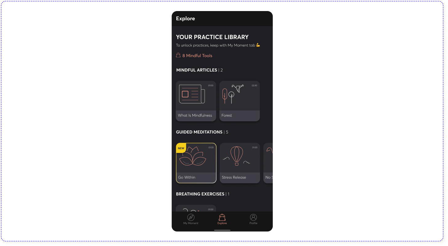
Action Item
Creating a library called ’Explore’ where every practice exercise that has already been done is opened for repeated practice
During the user research, many users testified that the app helped them form a new habit and persist in practicing mindfulness on a daily level, thereby reducing stress, increasing focus and concentration, and above all, being self-aware.
After the usability testing, we made changes according to the action items and after two months the app and the technology behind it has been sold to the Vi company and is about to be implemented in the US for millions of users. All the insights, recommendations and features that were designed but not yet implemented, were transferred to VI Labs.
Would you like to hear more? Talk to me in person