Client
Gerdcare
Services
UXR, UX
Year
2022
Gardecar is a medical startup company that has developed a device which interfaces with an app, for people suffering from reflux, heartburn and regurgitation. The advantages of the product: non- invasive, drug free, affordable and safe.
The company contacted me after a first clinical trial in Israeli hospitals, in order to improve the user experience in preparation for a wider clinical trial in the US which required making it accessible to the new target audience and adapting to the trial structure that included a larger number of stakeholders.
Clinical trail goal: The patients a must report several times a day, for 4 month, on health condition in order to find a correlation between the use of the device and relief of symptoms.
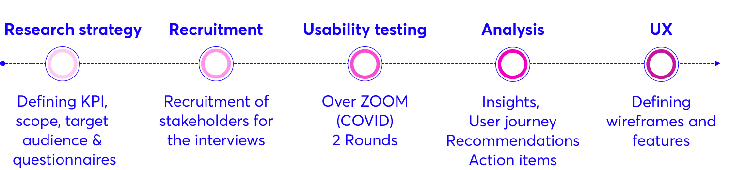
The Process
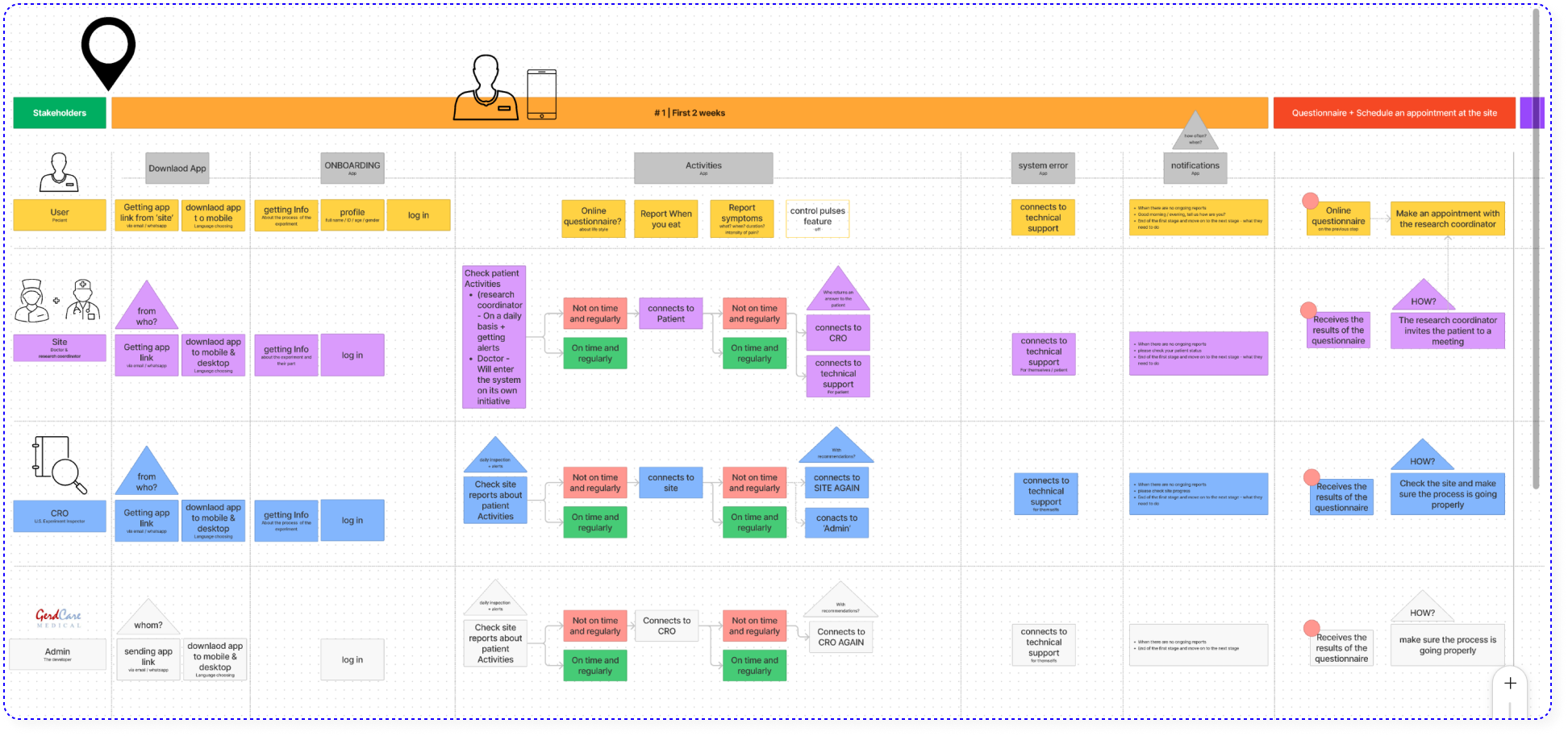
1. Mapping the system
By interviewing GerdCare team members, I understood the product, the usage scenarios and the structure of the new clinical trial. This project included 4 different stakeholders (The User – Patient, The Site – Doctor & research coordinator, CRO – U.S. Experiment Inspector, GerdCare – Admin & developer), due to the complexity it was necessary to map the stages that each of them goes through, and the relationship between them.
2. The challenge | Preventing dropout from the clinical trial
In order for the clinical trial to be successful, the patients must report 3 times a day for 4 month about their condition, this task is very challenging! In addition, there are a number of fundamental changes between the first clinical trial in Israel and the clinical trial in the US that could potentially be an obstacle to the success of the trial:
1. Number of patients: 20 in Israel, 300 in the USA.
2. Project management: In Israel, the experiment was managed by startup members who are experts in reading data and solving problems immediately. In the USA the experiment will be managed by the Site and the CRO (U.S. Experiment Inspector) who have to learn the system from scratch and do not devote all their time to this trail.
3. Personal contact: In Israel, the patients were allowed to meet/talk with the research coordinator on behalf of the startup and thus problems were solved in a short time and with personal guidance. In the USA, it is absolutely forbidden to do this.
3. Preliminary conclusions
1. The interface must be easy and clear to use, more than ever.
2. It is important for the patient to have someone to turn to and that the response be quick and professional
3. It is critical that the site and the CRO receive alerts at the right time, if a patient does not meet the trial standards.
4. Usability Testing | Round 1
At this stage, I prepared questionnaires and wireframes (LOW-FI) and went on a round of usability tests with patients who took part in the first trial, the doctor and a research coordinator who accompanied them and other members of the Grad Carr team.
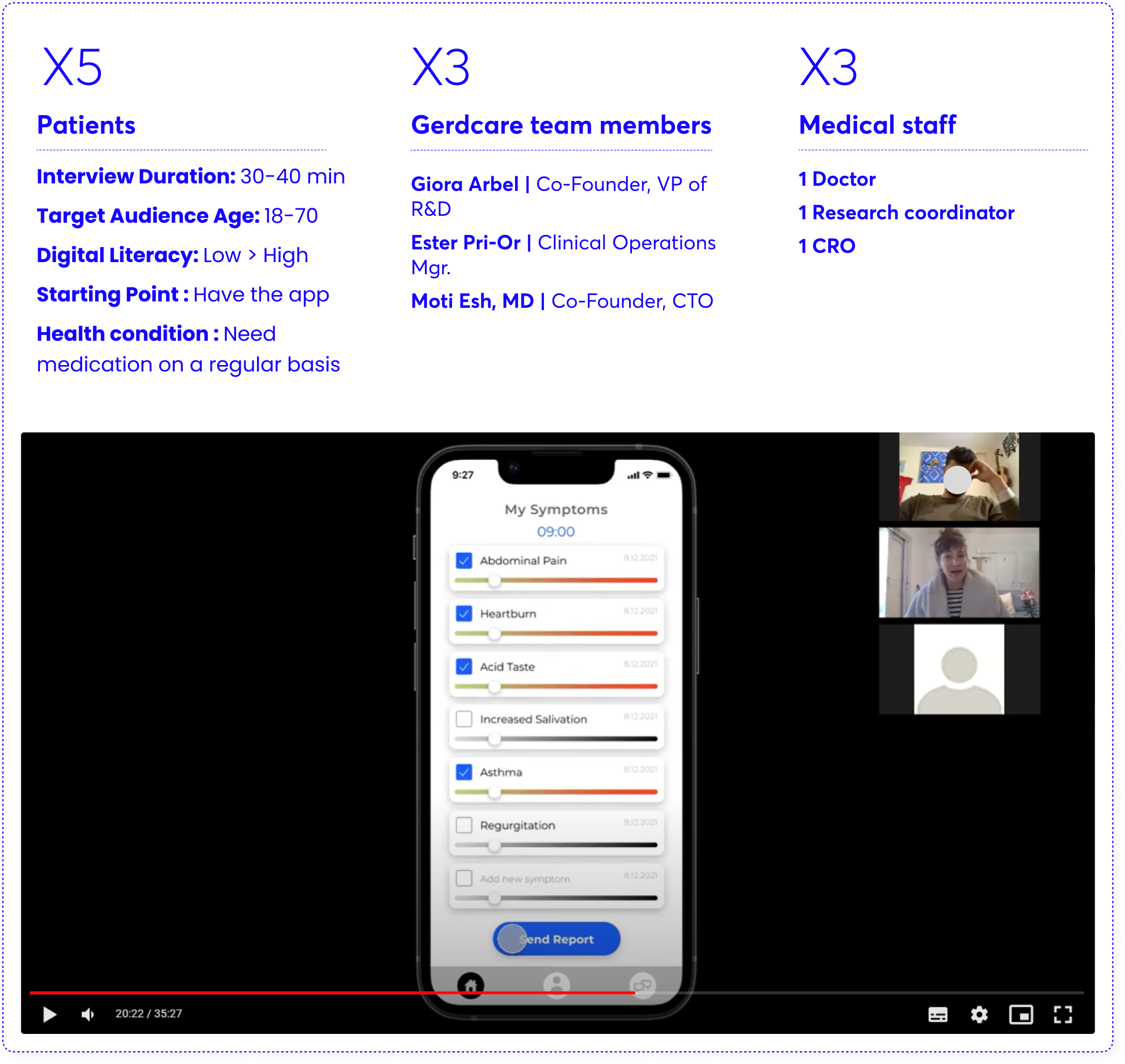
After this, I extracted insights, define new screens, create prototype and made another round of usability testing via ZOOM. after the second session I felt ready to create wireframes in High-fi.
Significant insights
The original plan was to build one App that would be used by all stakeholders, let’s find out what actually happened
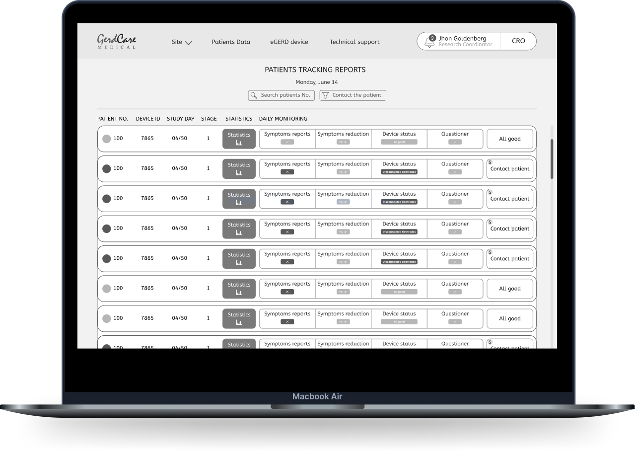
1. Two different systems are needed
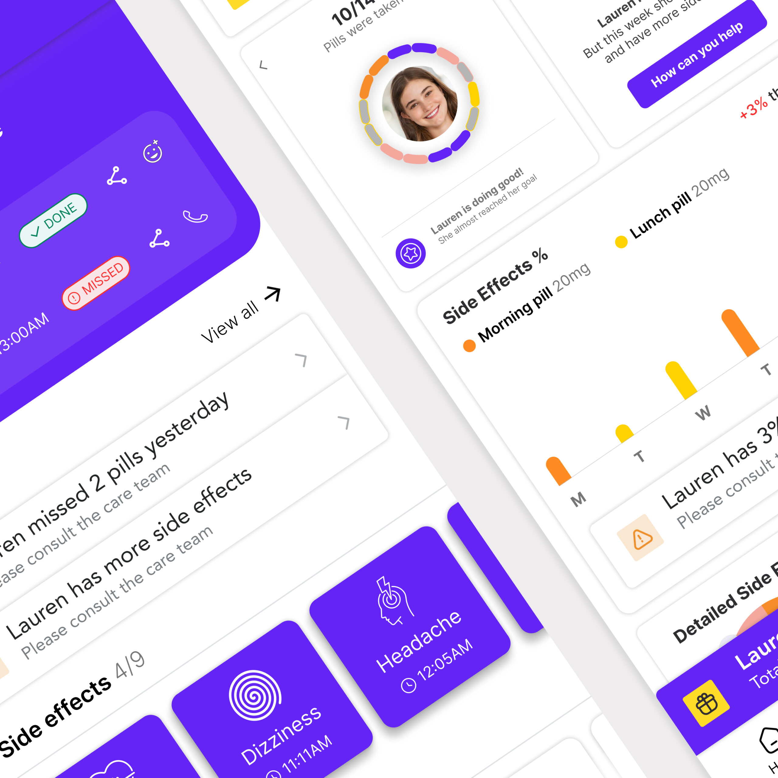
It is important that the medical staff receives alerts and reports about the patients’ condition on a daily basis in order to make sure that the trial is being conducted properly, therefore it is important to make the information available to them in the most convenient way. Mainly for security reasons, the medical staff works on a computer and not with the mobile, from this reason there will be a separate system designed for the desktop.![]()
“During the day I work on the computer, so it will be the most accessible for me to see the information there and contact patients if there is a problem”. research coordinator
![]()
If you would like to hear more about these features 👆 let’s talk
![]()
2. Daily commitment (X3) requires ease
Since every patient who participates in the clinical trail, is obliged to report at least 3 times a day for 4 months, it is necessary that the flow will be clear and the number of screens will be minimal, so it will be convenient for the patient to report anywhere and anytime throughout the entire period. ![]()
“The fewer screens I have to go through, and the more I’ll understand what to do there, the more times a day I will report my symptoms”.
“The previous app was really complicated, I didn’t really understand what to do”.
“If I had known in advance how many steps I have to go through, and have an indication of what stage I was in, I would feel more certain and confident to report every time something happens or when I received a push notification.”
![]()
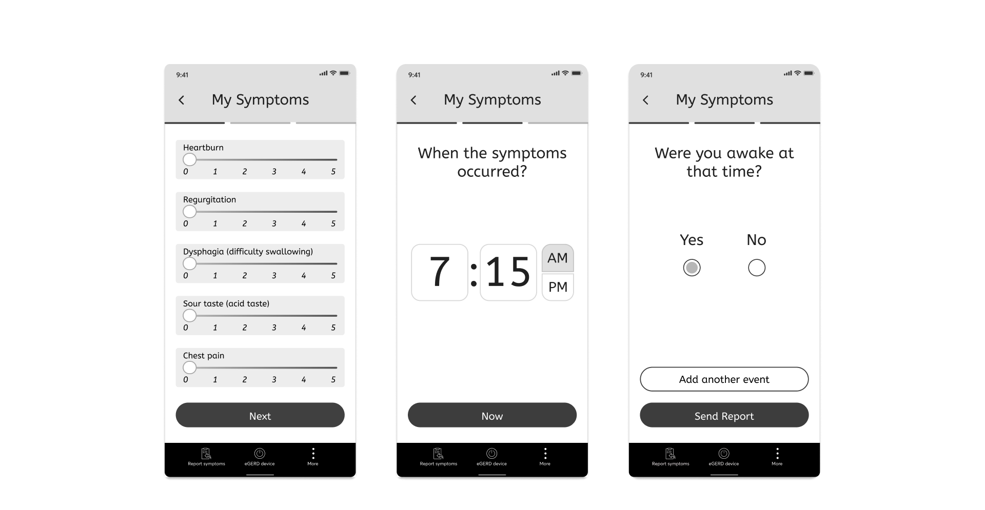
The solution: Reduction of the parameters that must be reported to 3 main ones: symptoms, the time they appeared and were they awake/sleeping at the same time + Progress bar which gives certainty.
![]()
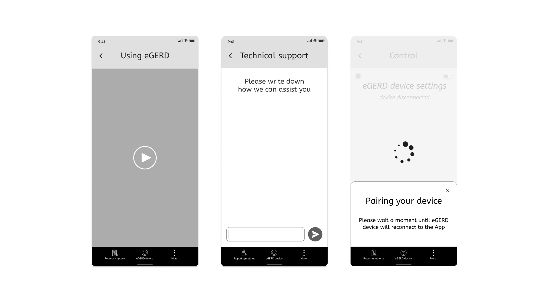
3. Support for wide scale
Compared to the study in Israel where there were 20 patients and there was a direct contact to Gerdcare, the study in the US will include hundreds of users, therefore we addressed 4 main features within the App:
- Create onboarding (didn’t exist before)
- Instructional video explaining how to use the device.
- Providing technical support regarding the use of the device and the app.
- If a technical problem arises, a pop-up appears with explanation and solution.
![]()
![]()
The application is under development and will be launched in several hospitals in the US for 4 months. Then we might perform usability tests in order to develop the application that will work regularly with the medical device.
Would you like to hear more? Talk to me in person